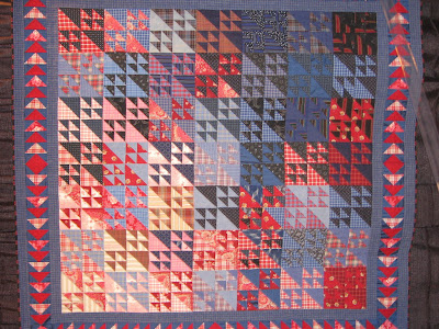
In the previous post we showed red and blue quilts, and mentioned that ivory and/or beige is a great complement (better than white, in our humble opinion). Even a hint of yellow is enough to round out a predominantly red-blue scheme, as shown in this wonderful scrappy quilt by Will Vidinic of Will's Quilts in Paris :
It's amazing how often we see red, yellow and blue in classic quilts. Consider the vintage Spanish-American war quilt shown below (seen at auction), which we like better than flag quilts done only in red, white and blue...
...and this vintage crib quilt which uses just a hint of yellow in the strips separating the orange and blue blocks:
and the famous Gee's bend denim quilt by Annie Mae Young, which graces the cover of The Quilts of Gee's Bend (published by Tinwood Media):
and what do you think about this early 20th century Afro-American quilt seen at auction? The blue dots at the intersections really cool down this fiery color scheme :
Many 20th century artists explored variations of red-yellow-blue, including Piet Mondrian, Alexander Calder, Mark Rothko, and Ellsworth Kelly. Ellsworth Kelly created his famous Blue Yellow Red IV in 1972:
In the past, we thought of red-yellow-blue as THE primary colors, as on the Itten Color Wheel. However, RYB is a historical set of primary colors that predates modern scientific color theory (see RYB color model). Using RYB as primaries yields a relatively small gamut, in which, among other problems, colorful greens, cyans, and magentas are impossible to mix, because red, yellow, and blue are not well-spaced around a perceptually uniform color wheel. For this reason, modern printing processes, as well as color photography, use cyan, magenta and yellow as primaries (CMYK, where K is black). We're training ourselves to use the 24-part Ives color wheel, which is based on CMYK (see Color Play
Many artists and quilters still work with Blue-Yellow-Red as primaries. But as Joen Wolfrom points out: "If you use red, yellow and blue for your complements, you're two steps off. That doesn't make an ugly quilt, but you could use the right color wheel and it would be stunning rather than okay." We would love to know if Ellsworth Kelly has changed his view of Blue-Yellow-Red in light of modern color theory (Kelly was born in 1923, and is now 87 years old). Let us know what you think !
 11:09 AM
 admin
admin


 Posted in:
0 comments:
Post a Comment